

What if Yorkshire Tea embraced a more contemporary visual identity?
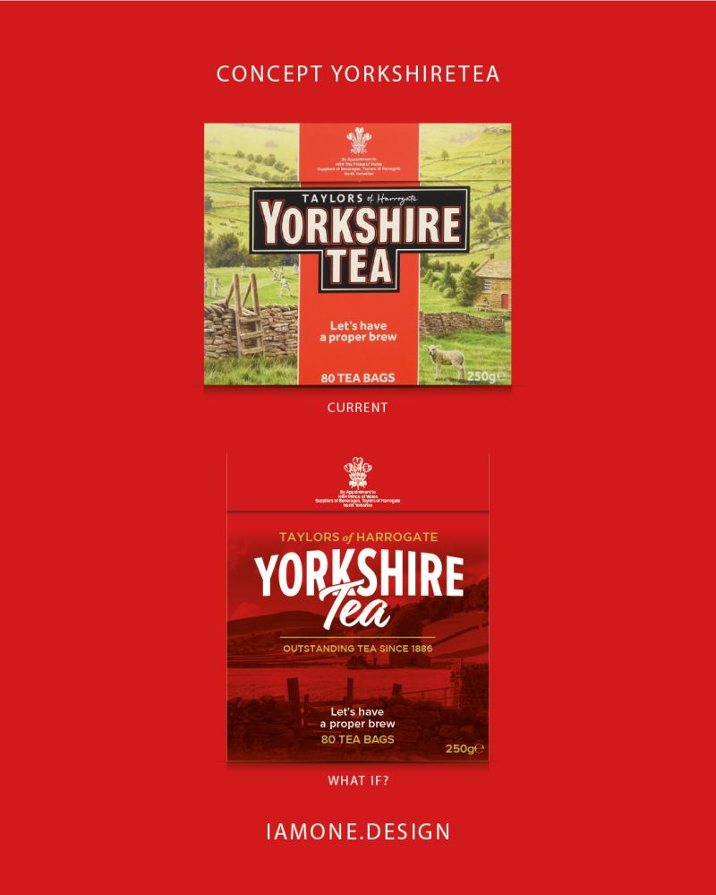
What if Yorkshire Tea embraced a more contemporary visual identity?
Yorkshire Tea has one of the most recognisable packs in the tea aisle. Its bold logo, distinctive red block and traditional countryside illustration have helped build decades of brand recognition. But I wanted to explore what might happen if the brand took a more modern approach while still holding onto the heritage that makes it so iconic.
The original design celebrates Yorkshire Tea's roots through illustrations and a strong sense of tradition. In my redesign, I looked at how those heritage cues could be simplified and distilled into a cleaner, more contemporary visual system. The Yorkshire landscape remains central to the pack, but is treated in a more graphic, atmospheric way, allowing the brand identity to take a stronger lead.
A key part of the redesign was refining the existing logo system. Rather than reinventing the Yorkshire Tea identity, I simplified and modernised elements of the wordmark while preserving the distinctive character that makes the brand instantly recognisable. The result is a cleaner, more contemporary identity that still feels familiar to existing consumers. The range was also reimagined through a revised colour system. While Yorkshire Tea already uses colour to differentiate variants, I explored associations that felt more intuitive for today's consumer. Green was applied to Decaf to reinforce commonly recognised links with natural, lighter and caffeine-free products, while blue was used for Hard Water, reflecting the water-focused nature of the blend. This creates a clearer visual connection between colour and product purpose while maintaining strong distinction across the range.
This concept isn't about replacing an iconic design. It's about exploring how a heritage brand might adapt to changing consumer expectations and retail environments. The challenge with brands like Yorkshire Tea is always finding the balance between preserving familiarity and creating something that feels relevant for the next generation.
What do you think? Should heritage brands protect their visual equity at all costs, or is there value in evolving iconic packaging to stay current?
If you're looking to launch a new product, refresh an existing range, or explore a retail extension for your brand, feel free to get in touch. www.iamone.design
Transparency Note: This is a self-directed concept project designed to explore ideas and craft. It does not represent a live client engagement, where outcomes are typically influenced by commercial goals, research, collaboration, and iterative feedback throughout the design process.


Comments